|
So, this is a reflection. I decided to put that here just in case you didn't read the title, but you wouldn't do that, would you? Anyway, enough of my stalling. So, this wasn't really that difficult, like at all. Just a lot of work really, which was kind of expected, unless you are Ben, then this is clearly the hardest class ever. My favorite feature of all of this website stuff was just the color schemes, and the logo. My least favorite feature was the hex codes, always forget those, not really, I don't really have a least favorite, but got to come up with something to meet requirements. How would I rate myself, probably a solid, what, 9.999999999999999999999/10. Clearly, that is accurate. 
0 Comments
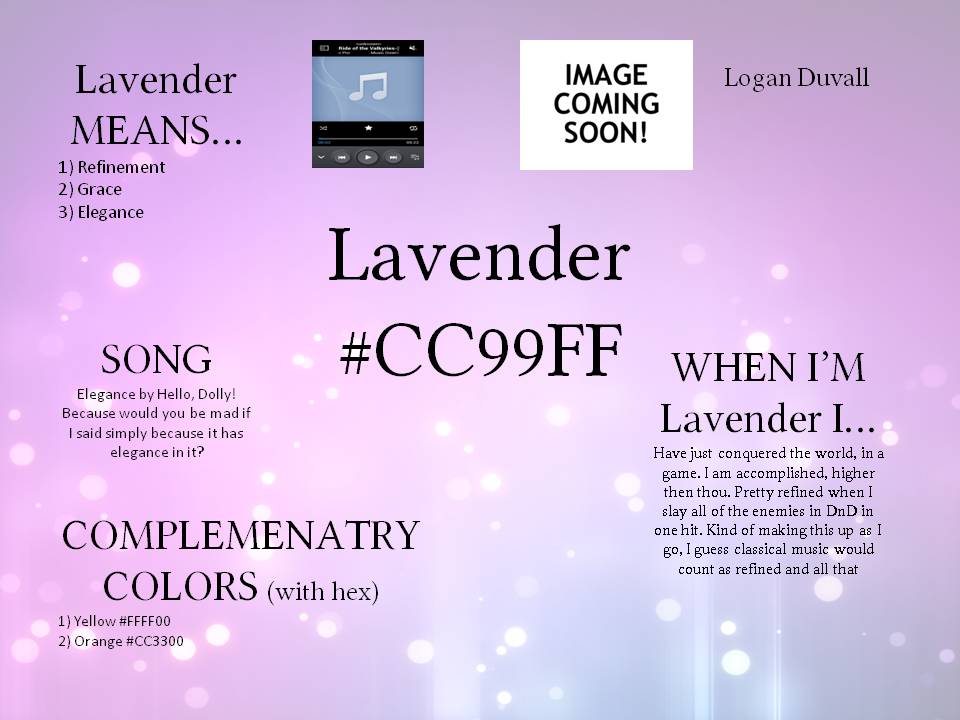
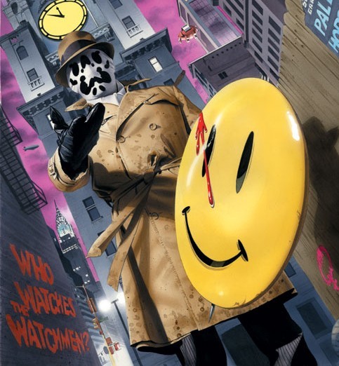
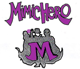
The main color in my logo is purple. It represents many things, here is a list: royalty, nobility, imperialism, spirituality, holiness, luxury, ambition, creative, offbeat, surprising, restful, fun, mystery, moodiness. The hex code is #800080. So, you see, the way it clearly captures my website pages is that my main power is mimicry. Mimicry being the ability to mimic anything really, so, why it shows the three different people, to kind of show it is all me, mimicking them. It also shows my other page with the other person thing is that one of those is one of his favorite characters, and he was heavily inspired by them, which one though, I wonder.
I step into others shoes all the time-Tagline(fifth draft) Rendering process was actually simple, as long as you are not Ben. The easy part was the paint bucket and then clicking, or should I say that was clearly the hardest part, but the harder part was doing the dodge tool at the bottom of the logo, then sharpening the rest of the logo and making it fade into the dodge tool. Oh, well the tools most helpful was the sharpening tool, it made the main look of the logo, also the paint bucket, that is how most of the color got into the logo, now you may be wondering why I chose this look, well, it is simple, I just wanted to be confusing, cause, you know, mimicking and turning into other people can be confusing, yeah, let's go with that.
My plan of action to making my logo is simple shape as the background, then some image on the front that I will figure out as I go along. The little navigation buttons will probably be random. So, I have no plan, the best of plans
My impression of using Photoshop Elements 9 was pretty rough. It was nice to use it and all, but miss the two days you do anything for it, and you are gonna feel like you just walked out of Okinawa during WW2. I realize that might be controversial somehow, so, imagine it with clowns and waters guns, i guess. Anyway, since people who use photoshop are usually not pros at this, here are some mistakes that they do; Non Professional photographers would usually use Photoshop for 1. A better way to keep track of photos. 2. Learn how to make photos look better 3. Learn how to present photos in a more creative way. 4 . Be able to share photos. Now, the three ways that you can edit in a quick fix are 1. The auto button 2.Using a slider, or 3. The thumbnail previews. Saturation is the intensity of a hue. Hue is a fancy way to be an di- I mean to say color. Some main topics that we learned in class for photoshop were, well the flipping doodlily is photoshop, also a lot about the quick fix interface and quick selection area. Now, if I had the choice to the change the name of the "quick selection tool," I would change it to just selection tool, because it selects things still, just not quickly, or in any way you want it. Now, my question is, how many photoshop programs would i have to run before i could reasonably crash a computer? Then finally the three keyboard shortcuts are:
1. CTRL+Z= undo 2. Hold down the space key to use the hand tool quicker 3. The left bracket key decreases the brush size and the right bracket key increaes the brush size
|
AuthorWrite something about yourself. No need to be fancy, just an overview. Archives
June 2017
Categories |
|||||||||||||||||
 RSS Feed
